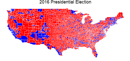
While learning a new graphics package in R, plot.ly, one of the practice examples generates this map of the 2016 Presidential election popular vote results. Any good analysis will surface surprising aspects in the data - below is a graphic that was unexpected for me.
This map shows, county by county, which party's presidential candidate won the 2016 popular vote. Verifiable, offical data is first choice if available but the most recent Federal Election Commission data is from 2014. On github, BC Dunbar provides this county data (link below) but I have not found citation for the source. I notice one oddity in the southeast corner of Texas (my home state)- Jefferson county is blue where I'd expect red. The site www.texascounties.net shows this county as red rather than blue...so BC Dunbar's data is not perfect (see NOTE).
Popular vote winner by US county. red = Republican, blue = Democrat
data source: BC Dunbar github repository https://raw.githubusercontent.com/bcdunbar/datasets/master/votes.csv
Voter Stats by Gender:
Citizens Eligible to Vote
Registered to Vote
Voted in 2016 Election
Male
107,544
68.6%
59.3%
Female
116,505
72.0%
63.3%
Total
224,059
70.3%
61.4%
Females have the most political power - 8.3% more eligible voters, 6.7% more females voted than males!
Small surprise - the Census Bureau has more up-to-date info about the recent presidential election on their website than the Federal Election Commission. Census Bureau figures are from exit polls - relying on reports from citizens rather than hard data collected during the voting process.
Customer Churn / Attrition, a Machine Learning approach
Was chatting with a friend, hearing about a challenge common in the SAAS (software as a service) industry: customer attrition or churn. I'm always listening for business issues that can be helped with use of data science tools so I revved up to see if machine learning could deliver some insight.
I pulled out Data Science for Business, Provost & Fawcett, that has a great case study on customer churn. Found a relevant customer churn data set (http://www.sgi.com/tech/mlc/db/). Telco industry rather than software but comparable customer activities: delivering services for ongoing regular payments.
Can we take this cloud of client data & find patterns that help us make better decisions? The question: Which clients are likely to leave? The strength of the answer surprised me. Running the data through several machine learning classifier algorithms - all models tested at >73% predictive on whether an individual client is likely to leave. For a data scientist, this is an unexpected level of accuracy for a first pass training session. It reinforces the power of applying machine learning to business challenges, even using smaller data sets that may have only a few thousand, or even hundreds, of entries.
Many variables in this data set seem to be around utilization of different services and level of usage. To answer this type of question in your business, data would likely be assembled from multiple sources: CRM system, financial system, internal platforms/databases or even external sources like economic trends or stock prices.
The first benefit in examining data aggregated from all available sources & through the fine-tuning of the predictive model - you'll uncover new relevant data points to track in the future to improve your predictions.
Next benefit is hainge a list of clients rated by probability of leaving (or whatever the question is that you're testing). Via your model, you'll know what an at-risk client 'looks like', can identify them in your current client base or evaluate prospective clients for 'stickiness' of your product/service offering.
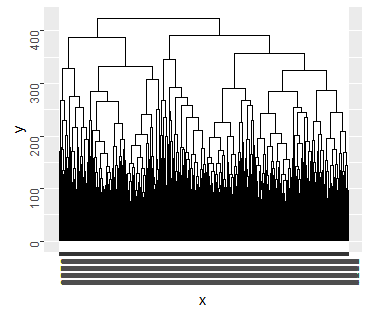
Clustering is another machine learning approach...a look into how a population can be divided, starting with the criteria you select (such as likely to leave or likely to be profitable). The cluster diagram gives you a feel for groupings of your population of clients. The dendrogram (hierarchical diagram) shows the dividing points that the machine perceives, defining segments of the population.
The benefit is in the progression from discovering 'who is at risk' to giving you groupings that can inform your strategy to retain a higher % of clients. The machine has no way to know the reason for each branching, so branches of dendrogram are unlabeled. You applying your understanding of the customer's why's to label those nodes. Your analysis is better informed by the groupings that emerge - with which types of clients are leaving and which types are staying (equally important insight to your strategy). Maybe you pinpoint the reason to be defection to a competitor, or different types of clients went to distinct competitors. Or maybe one of the groupings indicates that you lost clients based on price.
Heirarchal diagram - quantity of branches was not limited, leading to excessive overwriting of client names at final branchinggotta love output like this radial dendrogram
Details on the machine training:
Data source: www.sgi.com/tech/mlc/db/The data set has 5000 rows, 21 features (columns) including the target classification. 3 files to download: churn.data, churn.names, churn.test. The data is already split into train/test subsets
The data set, from the telco industry, was cleaner than you'd typically expect. No missing data, categorical variables were easy to turn into one or zeros. Evaluating the 20 features, I selected the 4 variables that most strongly correlated with the target classification (churn or not churn)...I trained logistic regression, random forest and neural network models using the R Caret package. Caret has some features that enhance accuracy over a simple call to randomforest for training, but it's much slower than a direct call. I'll often use the direct call (to whichever algorithm I'm using) for error testing then use caret at fine-tuning stage.
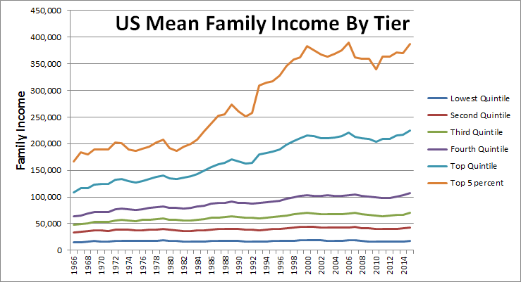
Check out this snapshot of family incomes from the Census Bureau. I set out looking into correlations between federal income tax rates, GDP growth and US Budget deficits - until I started wading into the morass of shifting tax rate tiers -- what a mess! Look for another blog post when I get that sorted.
Early years show gradual income growth (in adjusted dollars), then there seems to be an inflection point for higher income tiers around 1982. I'm still working on making tax rate tables compare-able, but I do see that the top federal income tax rate dropped by 29% (from 70% to 50%) in 1982. Btw, there was another 30% reduction in max income tax level in 1964 (from 91% to 70%).
Are there conclusions that these trend lines show us? Dunno. The flatter growth rates for lower income tiers and their disparity in growth with higher tiers may be a factor in a feeling of being left behind by the system. Or - an opposite explanation - there may be a progression of taxpayers upward through these tiers, bearing out the American dream. After getting a feel for the data, next comes creating/testing a hypothesis to find the cause(s).
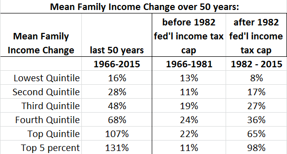
Income in 2015 CPI-U-RS adjusted dollars Source: U.S. Census Bureau, Current Population Survey, Annual Social and Economic Supplements. For information on confidentiality protection, sampling error, nonsampling error, and definitions, see //www2.census.gov/programs-surveys/cps/techdocs/cpsmar16.pdfGrowth rate by tier before/after the reduced maximum rate, across 50-year period
Have you heard political arguments about the preference of one party or the other on social spending -vs- defense spending? May be interesting to look at some data! Each blog post is (aims to be) around interesting data sets or twists on visualizations or interpretation. Here are some visualizations of data on tax/deficit levels, sources of US gov't revenue and expenditures.
- first a quick sidenote on levels of US taxation on Gross Domestic Product (GDP): Fed'l tax receipts lagged GDP growth (output to be taxed) by 8.65% 1961 - 2015
(US OMB & World Bank data)
Note the trend in tax receipts growth showing similar variance but with much greater magnitude than before 2000. Reverting in recent years to an earlier normal.
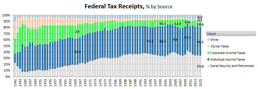
Sources of Federal Revenue as a % of total US revenue; categories shown as used by US government.
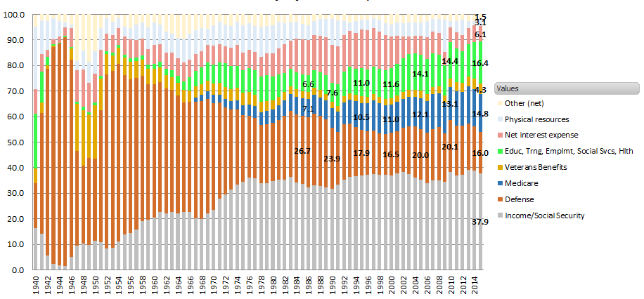
Federal Spending - Social Security included
Note some large shifts - Social Security starts in the 1940s and continues to expand, Medicare begins early 1960's.Spending levels, by US Office of Management and Budget.
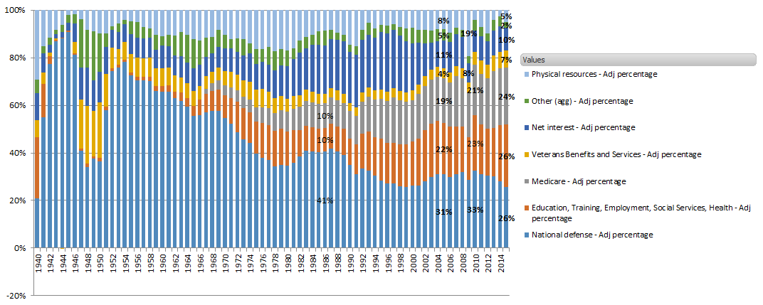
Federal Spending with Social Security netted out, % by Category
Looking at the above chart of Federal Spending, I thought I had a good picture of the split between defense/social spending categories
Clearly Defense spending as a % of Total Federal spending is declining, Social spending is increasing.
The scale of the spending was equalized across the long time period by using % of Federal Spending. Perfectly valid way to avoid adjustments in the data for inflation...but it occurred to me that large changes in the spending allocations (rise of Social Security as a source of tax collections and largest single outlay) might be skewing the message.
Looking at this unique category, I see that inflow/outflow for Social Security money is nearly a wash in the federal budget, only slightly more is paid out than is collected each year. If I just pull Social Security out of the data, the net impact being very small...what is the picture like?
Federal Spending - Social Security excluded
(excluded because Social Security revenue/spending are nearly equivalent so ins/outs become 'noise' in this analysis)
This better description of Spending shows the scale/relationship of spending categories with less distortion
Defense spending has come down to 26% of total (non-Social Security) govt spending, down from a staggering percentage in earlier decades. Social spending continues expanding and in 2015 was about 50% of US govt spending. 1993 was the turning point when Social spending surpassed Defense spending as a % of US tax receipts. Some amount of Medicare expense should be subtracted from this 50%, the offsetting income was obscured.
I think further digging into sub-categories of gov't spending will show that the real driver of the expansion in Social spending is cost of medical care.
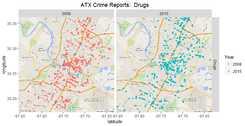
Data sets of public interest are increasingly available for download. Roughly 22 police departments across the country have so far started posting Crime data for public usage.
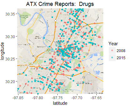
Mapping is such a powerful visualization tool that it frequently brings out insight that would be hard to access otherwise. This example uses Crime Report data from Austin Texas, but the same approach applied to your business data - Sales, Revenue, Addressable Market, etc. - can enable valuable understanding. Two types of maps are shown - all data in one map and faceted, the two reporting years separate. These map arrangements compare two points in time...other categories and more time periods can be depicted; area included in the maps can be zoomed in or scaled outward to include relevant geographic areas.
This data is a sampling of the Austin Crime Reports...as with so many data sets, clean up is necessary Only ~8% of entries in the raw data have geo coordinates. Other important factors must usually be accomodated; for example, from 2008 to 2015 (years whose stats are available), Austin had substantial population growth. Further analysis with this data set might call for some processing such as converting instances to crimes per 100,000 residents (cluster in the center of map is most population-dense sector). Another caveat is that the classification method for sexual assaults changed during this period, making 2008 stats not totally comparable to 2015.
Using R, I have categorized a sampling of the crime reports; and filtered to one crime type - Drugs. Next post, I'll be exploring a method to generate a dashboard that allows crime type to be selected and (hopefully) allows map to scale at the push of a button.
I'm generating this visualization using R. Another great tool for generating map visualizations (or a wide range of other useful visualizations) is Tableau. Tableau is easy to use but medium expensive; on the other hand, R is free but does require some investment of time to build capability.
Select an analysis topic from our menu that will be valuable for your business, or devise a custom analysis.
Projects are engagement-based - you provide the question and the data set compiled through your business activities; we data mine with statistical/machine learning tools to surface insights. Analyses come to you as informative graphics with a summary of the conclusions.